THE DEATH STAR
The Death Star from Star Wars: Episode IV – A New Hope was one of my first truly large-scale projects.The goal was clearly defined from the start: to build a Death Star with a minimum diameter of 50 cm, made entirely from scratch.
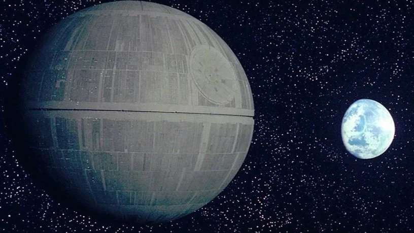
© Lucasfilm Ltd. / Disney Reference image for documentation purposes only.
Research & Preparation
Early on, it was important to me not to simply improvise the surface, but to recreate it as accurately as possible. This meant I had to take a deep dive into the model-maker community. Through a forum, I was able to find a two-dimensional surface layout of the original Death Star. This template could be projected onto a three-dimensional sphere. In practice, it was a 1:1 surface map that I could wrap around the spherical body. This made it possible to reproduce the surface structure and details almost exactly as seen on the original model.
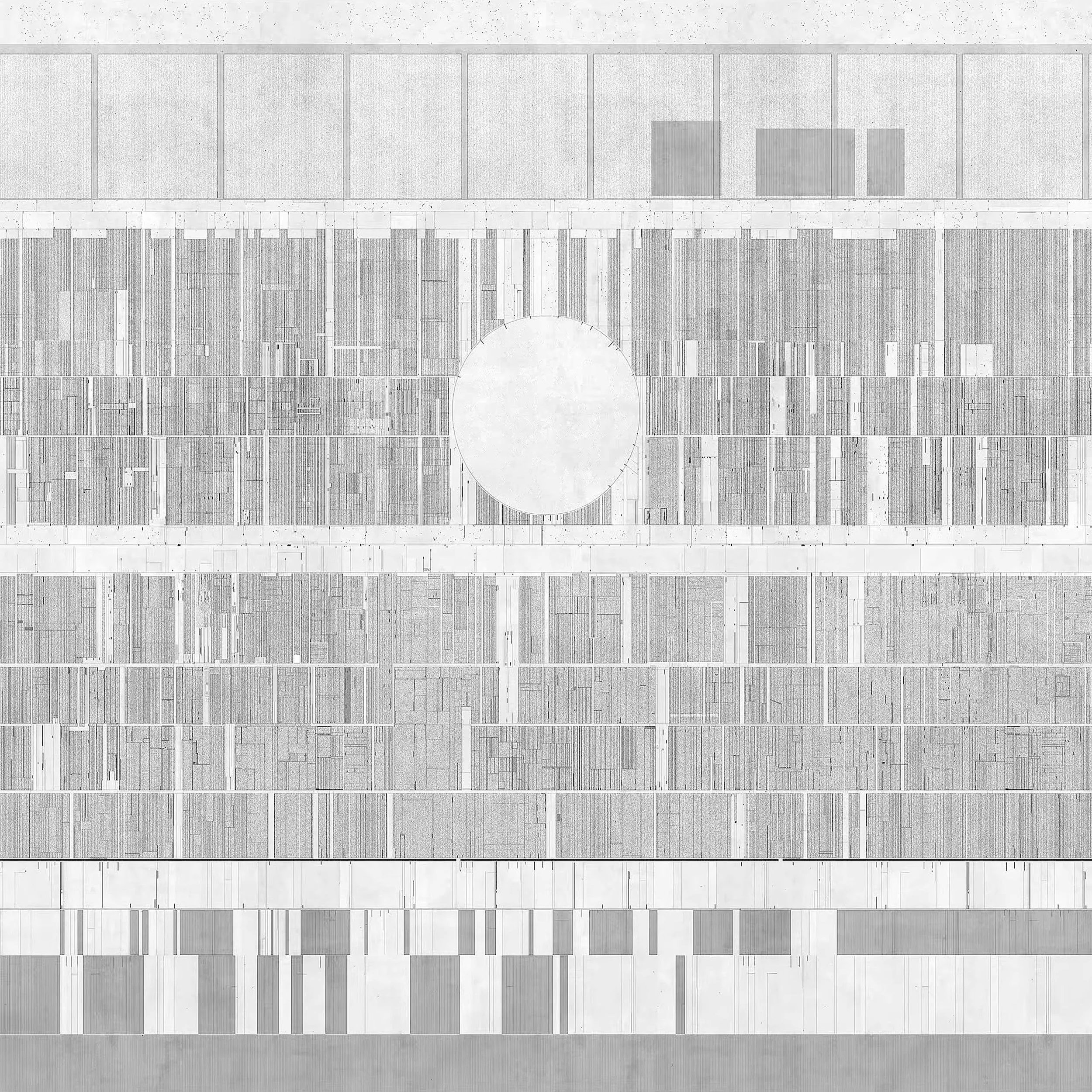
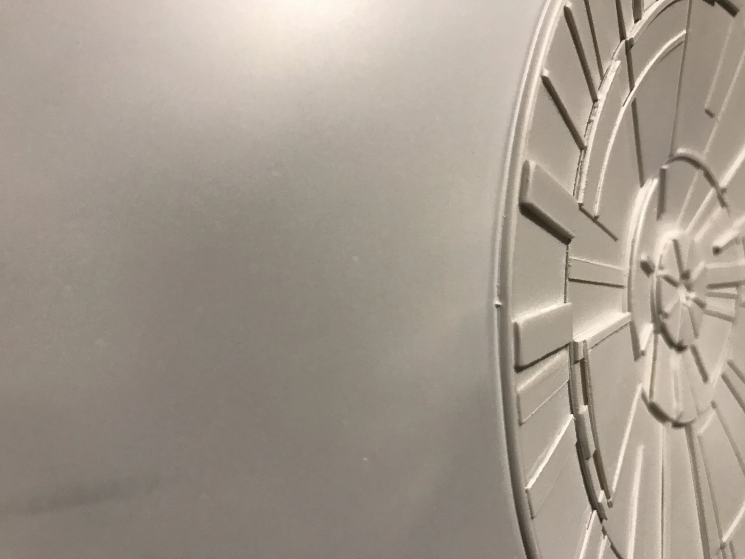
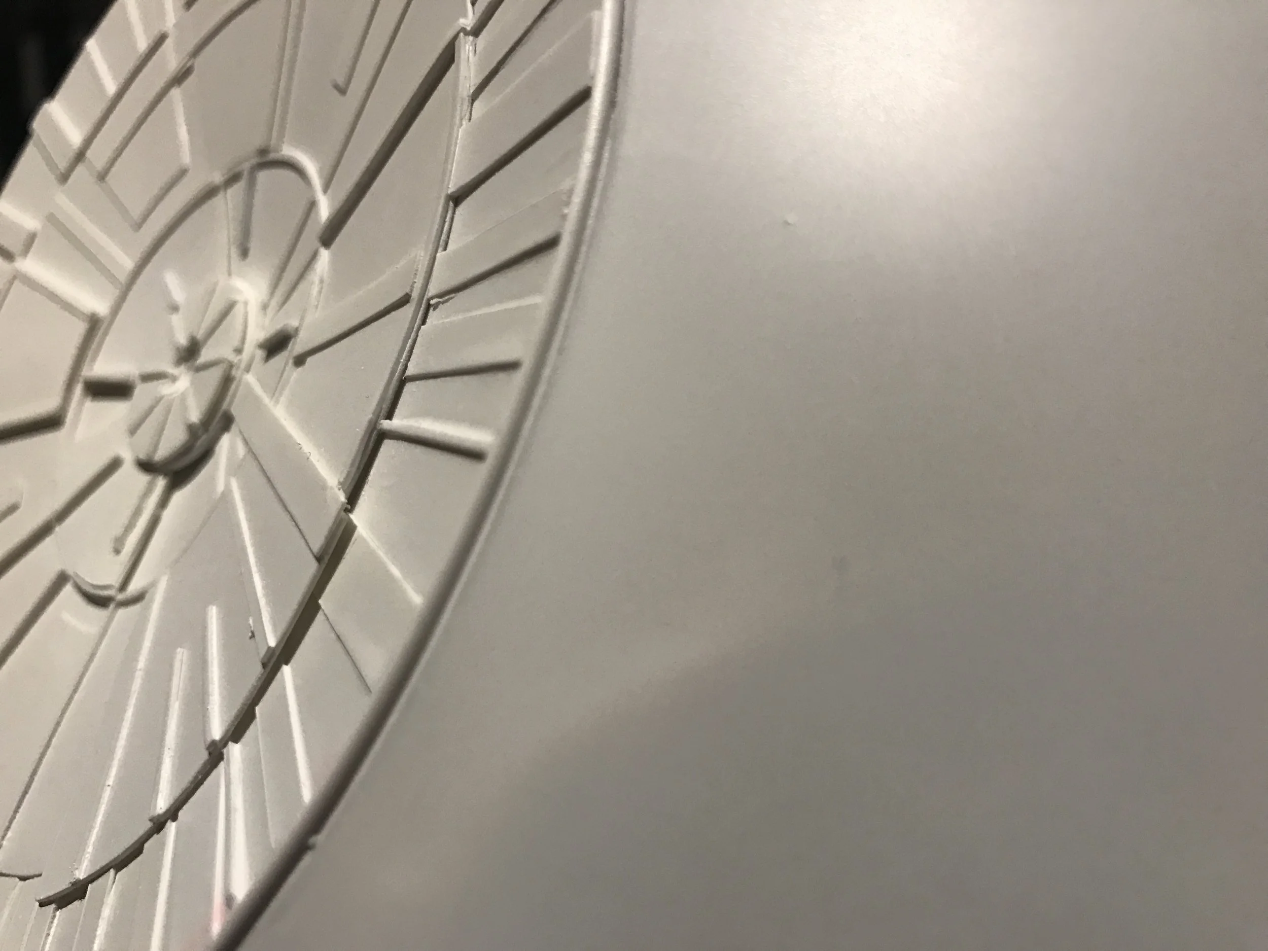
NORTH & SOUTH POLE
What really became fascinating for me during the build was the fact that I also had to deal with the north and south poles of the Death Star. Up to that point, neither the north nor the south pole had ever been shown in the films or in any literature. It wasn’t until Rogue One that you finally got a rough idea of what the north pole might look like. That was a huge help. From there, I was able to do a deep dive online and find reference images to guide the design. So for everyone who has ever wondered what the north pole of the Death Star looks like — here you go.
© Lucasfilm Ltd. / Disney Reference image for documentation purposes only.
THE TWO HEMISPHERES
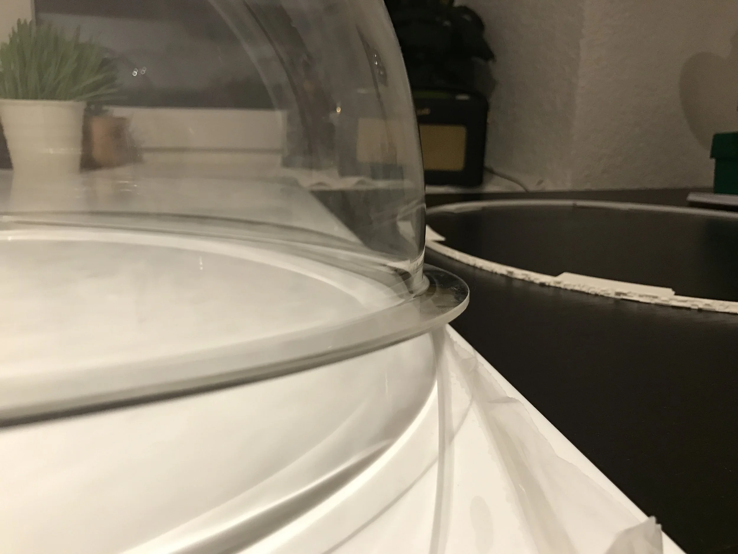
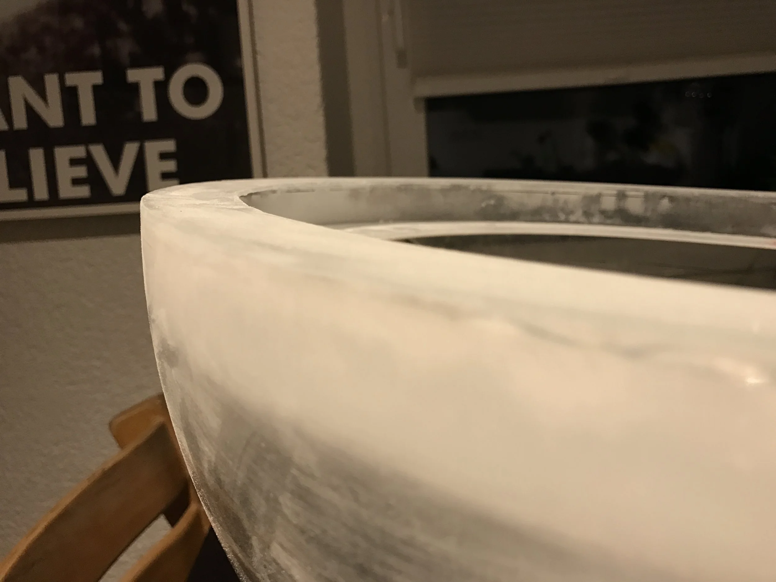
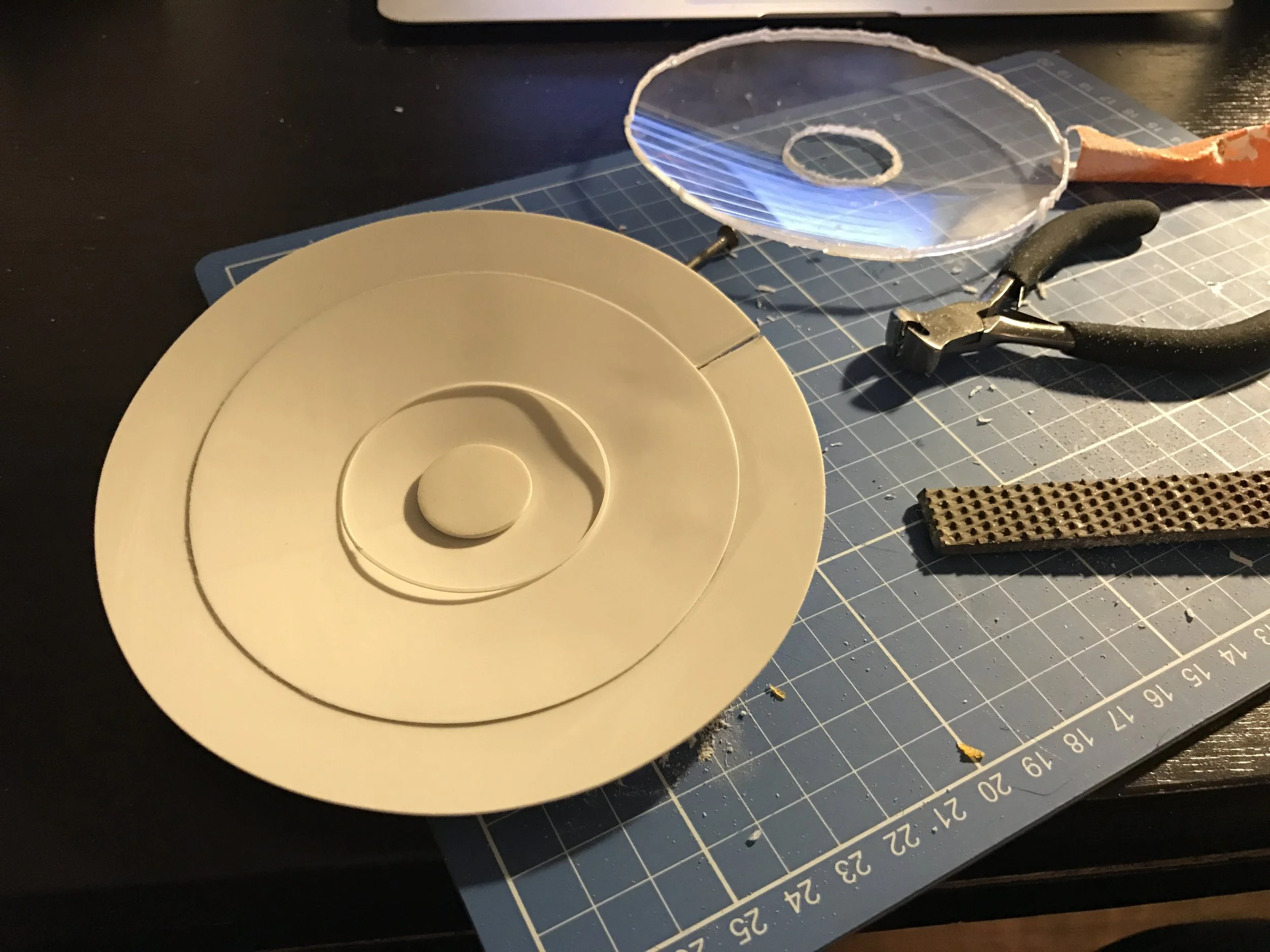
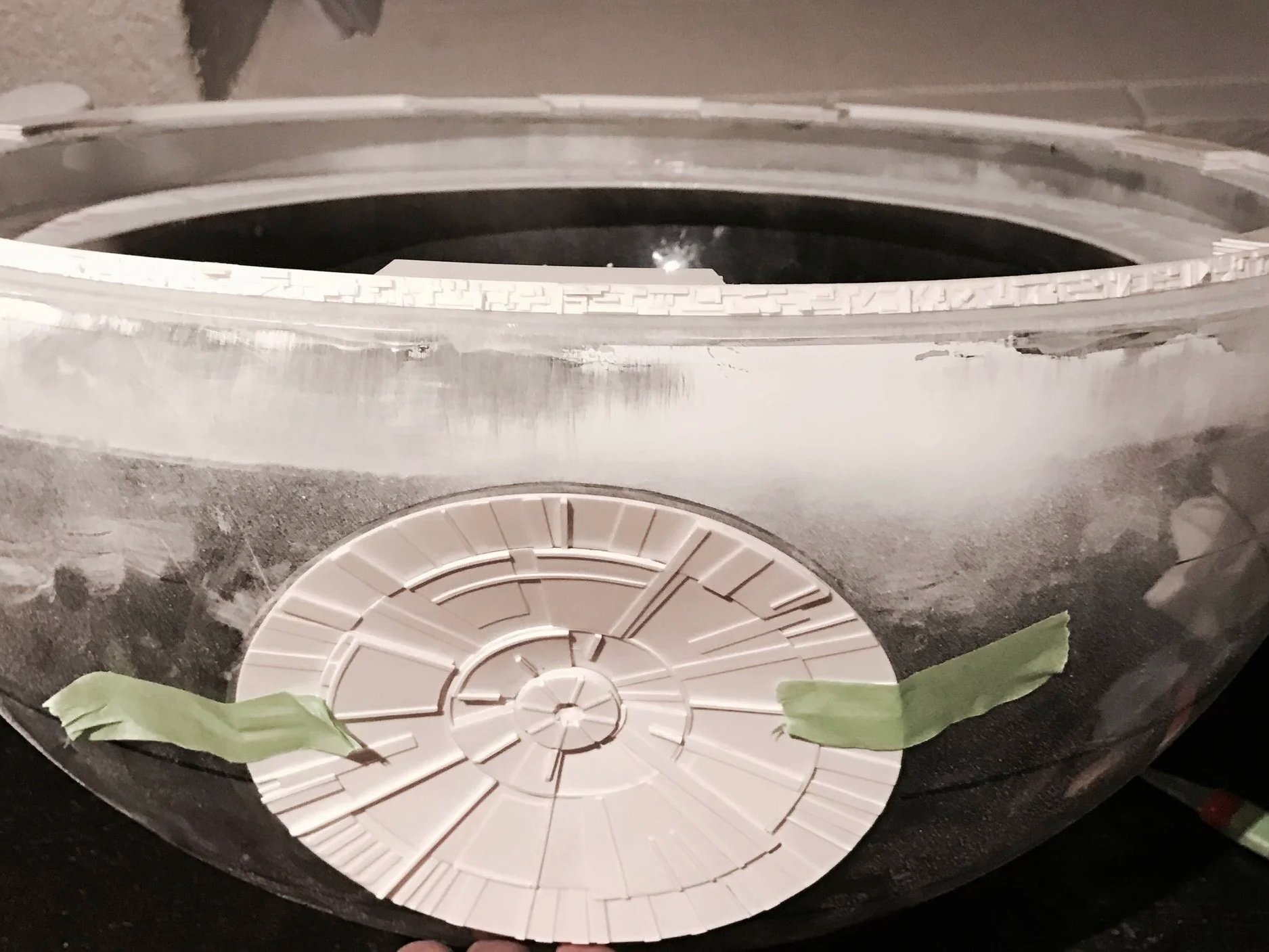
You wouldn’t believe how difficult it is to find a 50 cm diameter hemisphere online that is strong enough to support itself. In the end, I had to use retail display bins — the kind of bins you often see in department stores. The problem with these bins is that they have a small outer rim, which is designed to keep the container from slipping through its metal stand. For my purposes, this rim had to be removed. Doing that on 3–4 mm thick acrylic (plexiglass) is far from easy.
On top of that, part of each hemisphere had to be removed anyway so that, once both halves and the equator were combined, the result would be a perfect sphere. That meant cutting away material from both hemispheres, including the rim. Only then did it become obvious that the rim wasn’t just there to prevent the bin from slipping — it also provided structural stiffness. Once the rim was gone, the hemisphere became extremely flexible and almost floppy.
To solve this, I had to replace the lost rigidity by building an internal support ring along the inside edge of each hemisphere. This was something I hadn’t planned at all before starting the build.
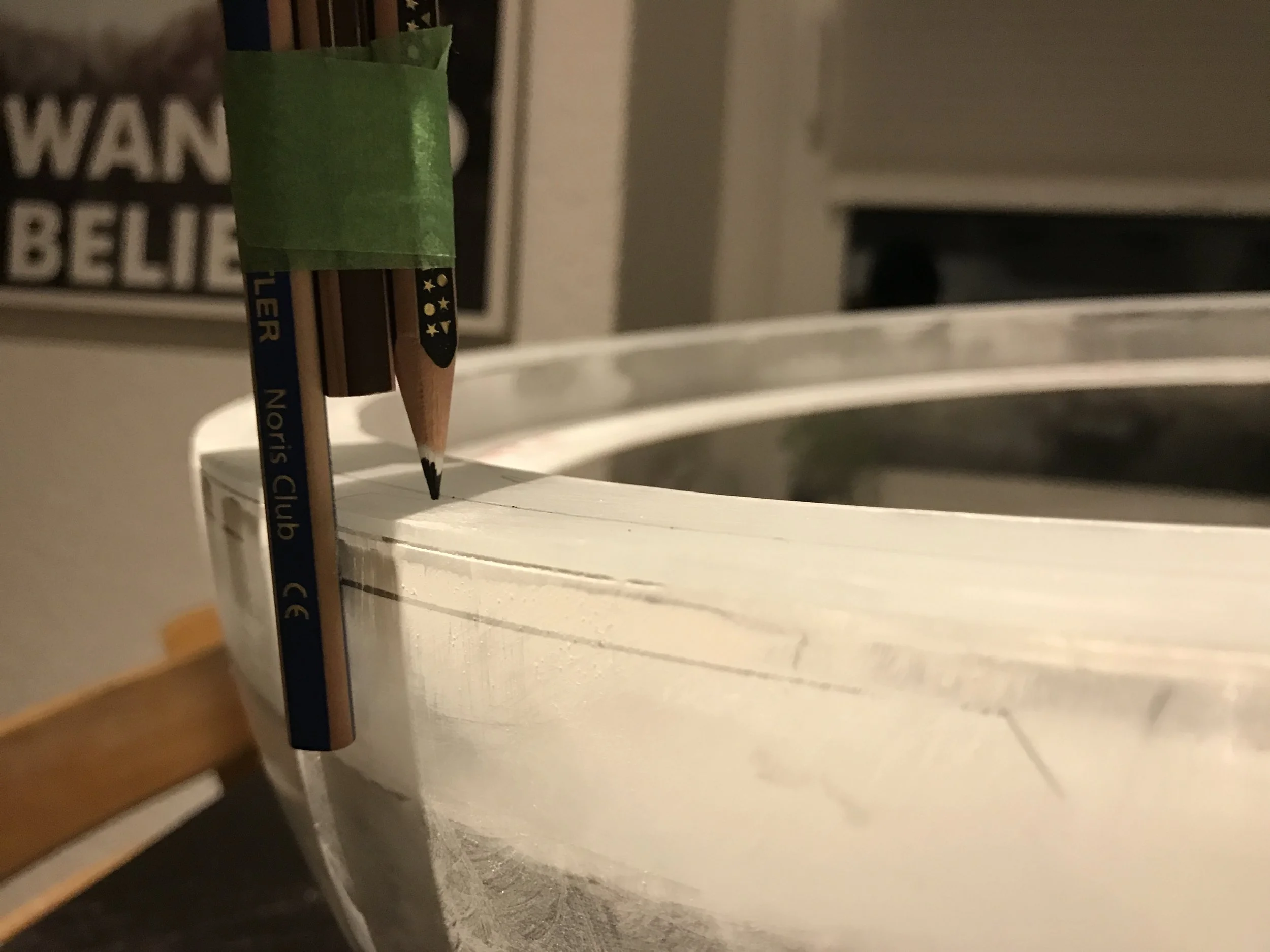
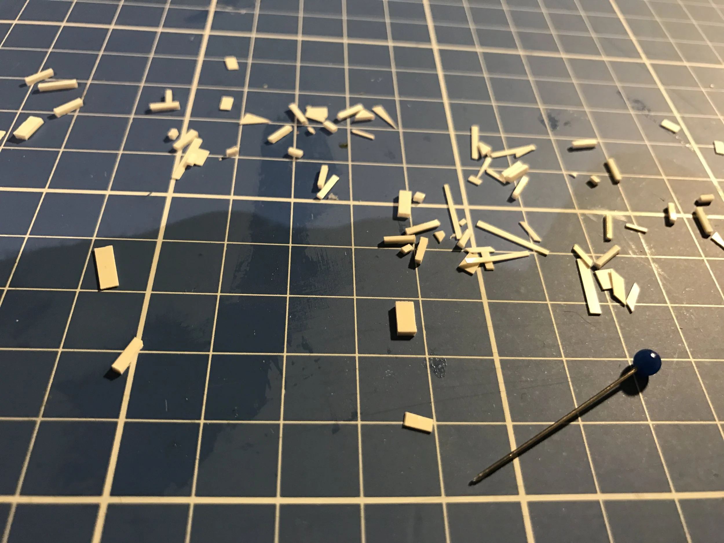
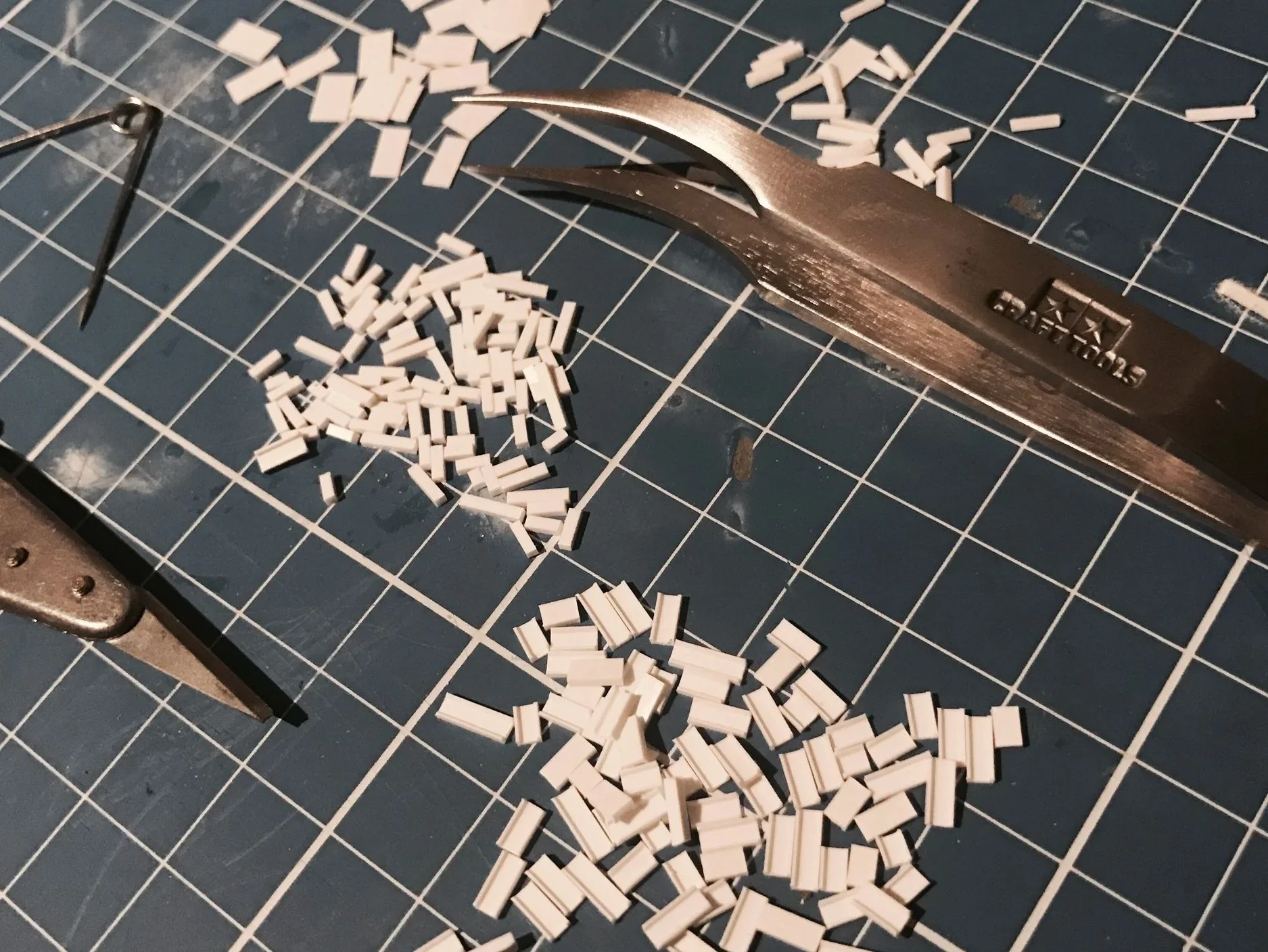
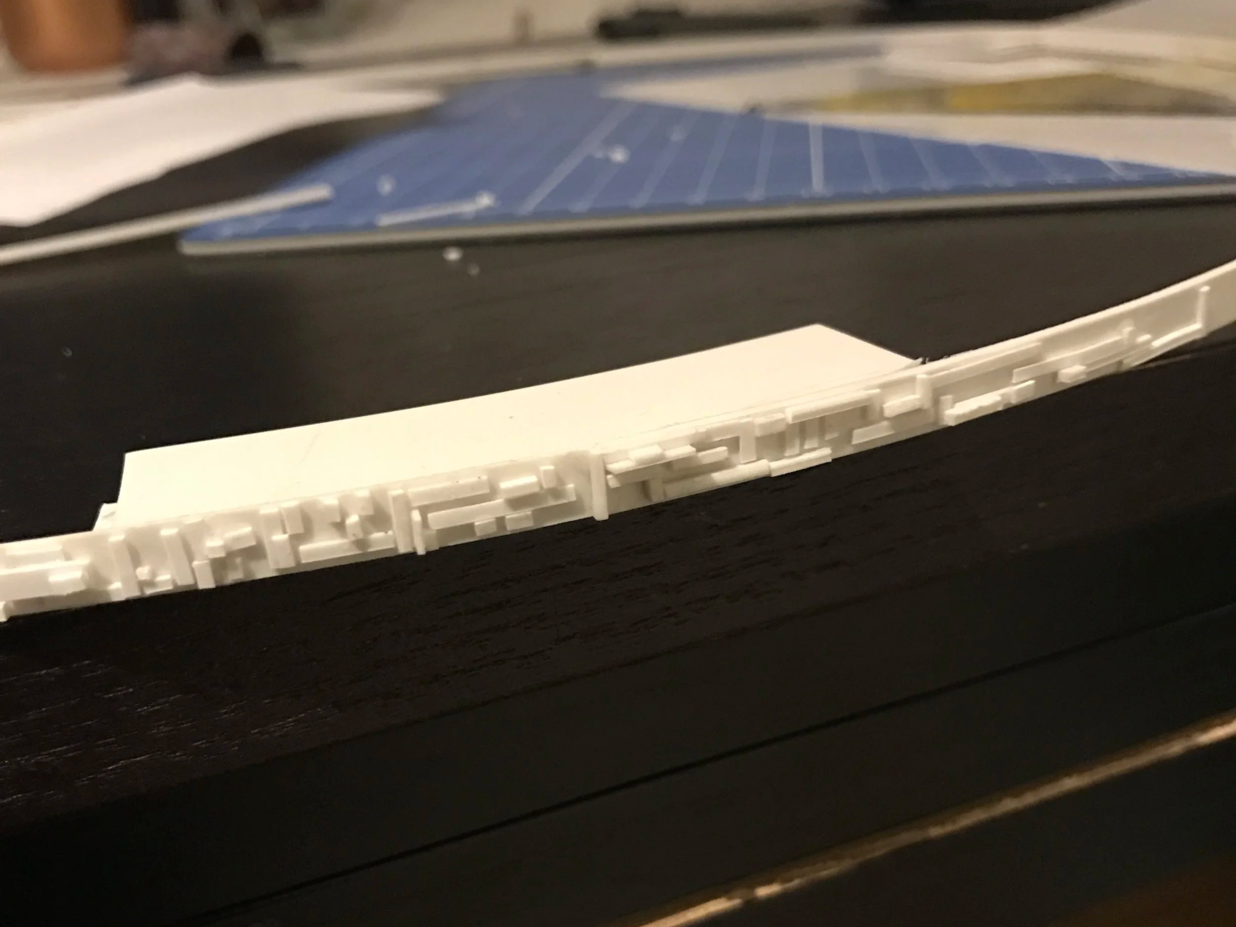
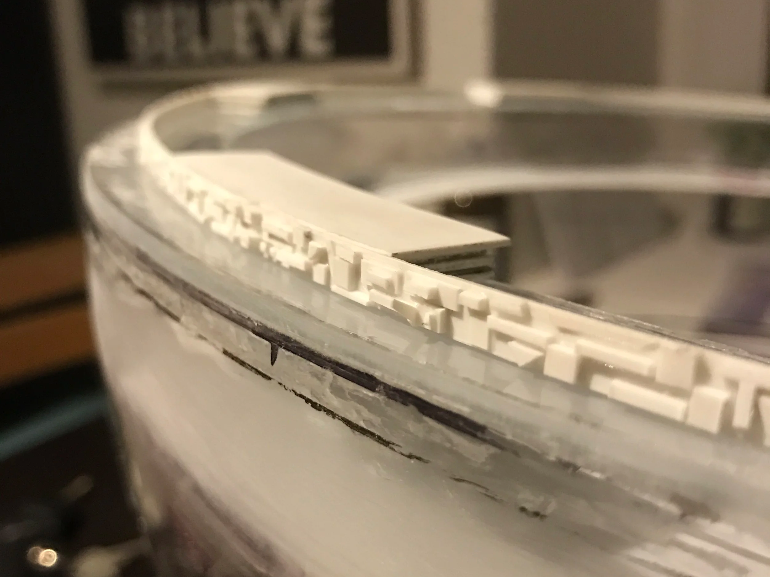
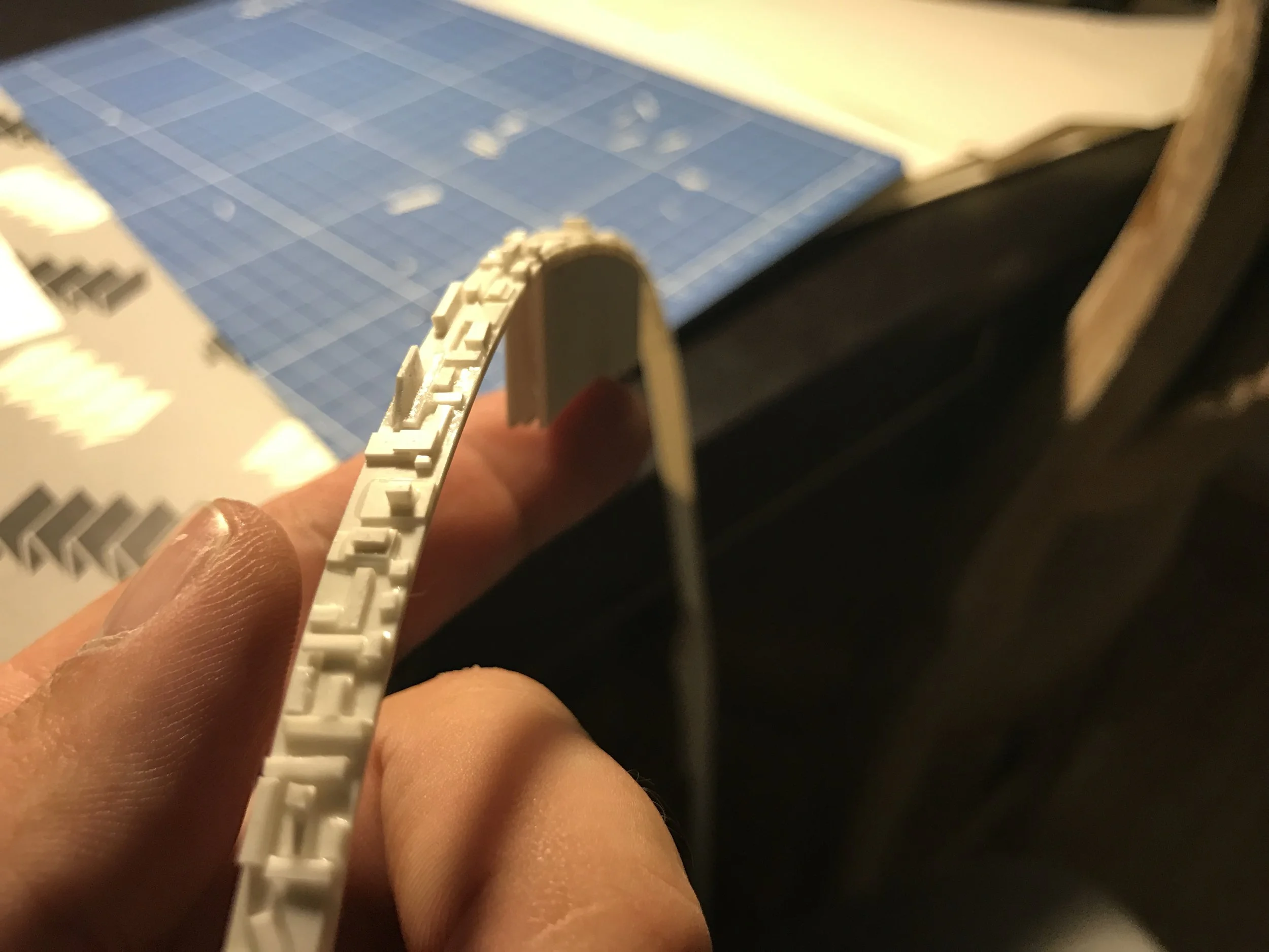
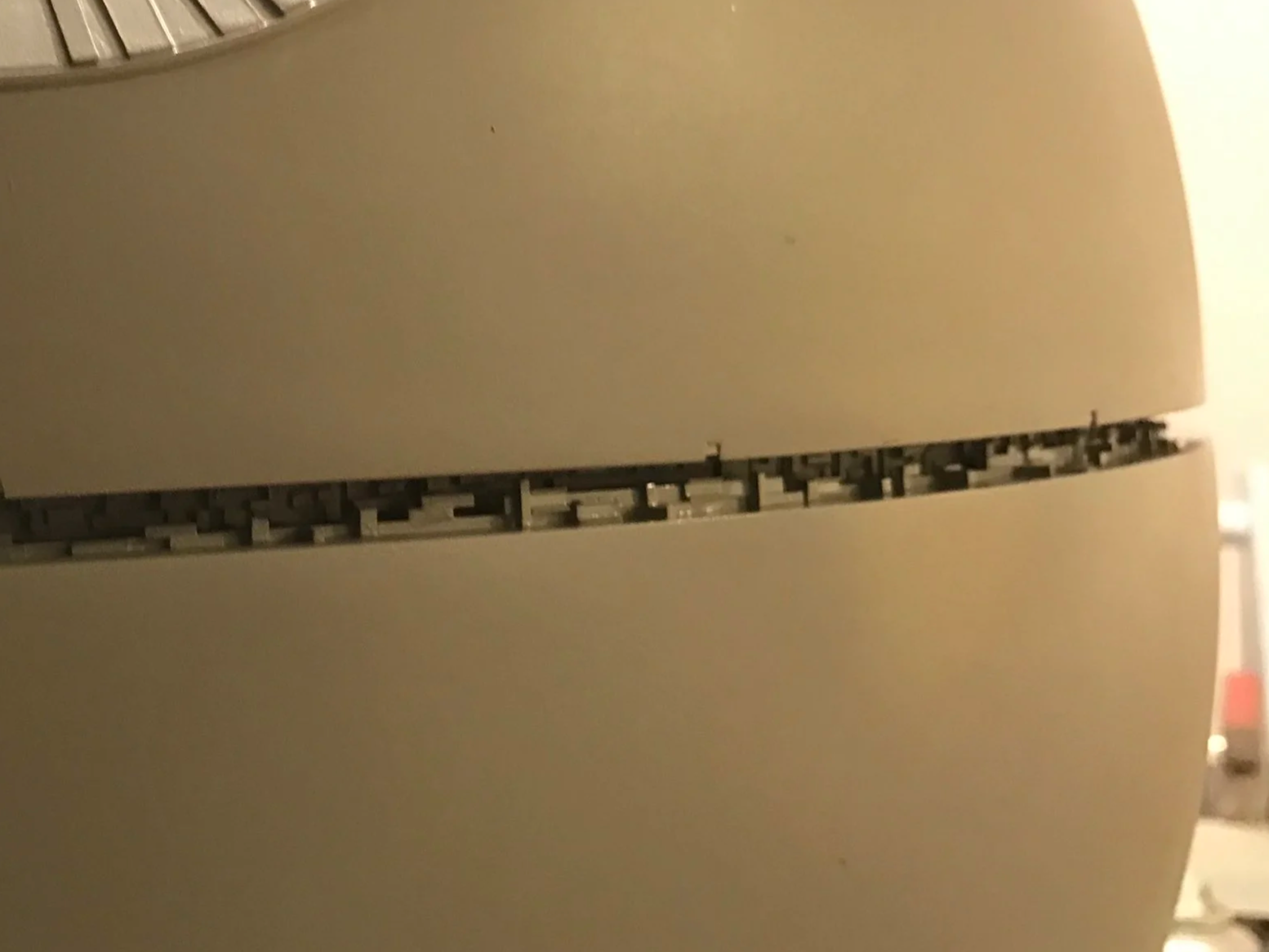
THE EQUATOR
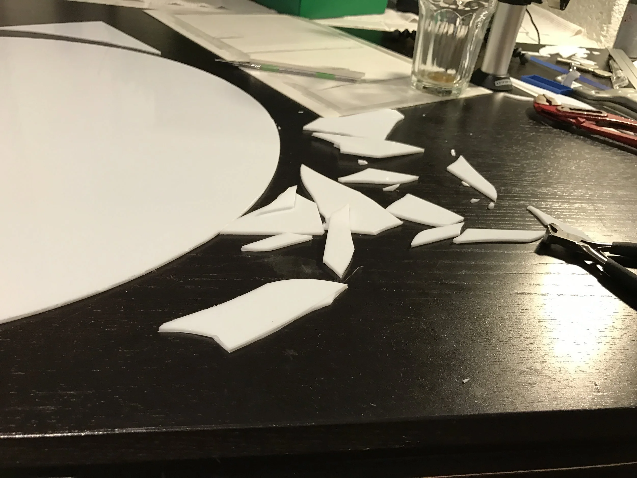
One aspect that was especially important to me was achieving an accurate and highly detailed equator. I had seen several Death Star models built by other model makers before, and in many of them the equator always felt like the weak point — the place where I thought: this is where they either ran out of motivation or didn’t fully explore how detailed this area could be.
For me, the equator became a project of its own.
I honestly don’t know how many evenings I spent working on it. I cut out hundreds, if not thousands, of tiny styrene parts and gluing them one by one. Some of these pieces were so small that the only way to handle them was by picking them up with sewing needles and carefully placing them into position.
It was a slow, meticulous process — but also one of the most important parts of the entire build.
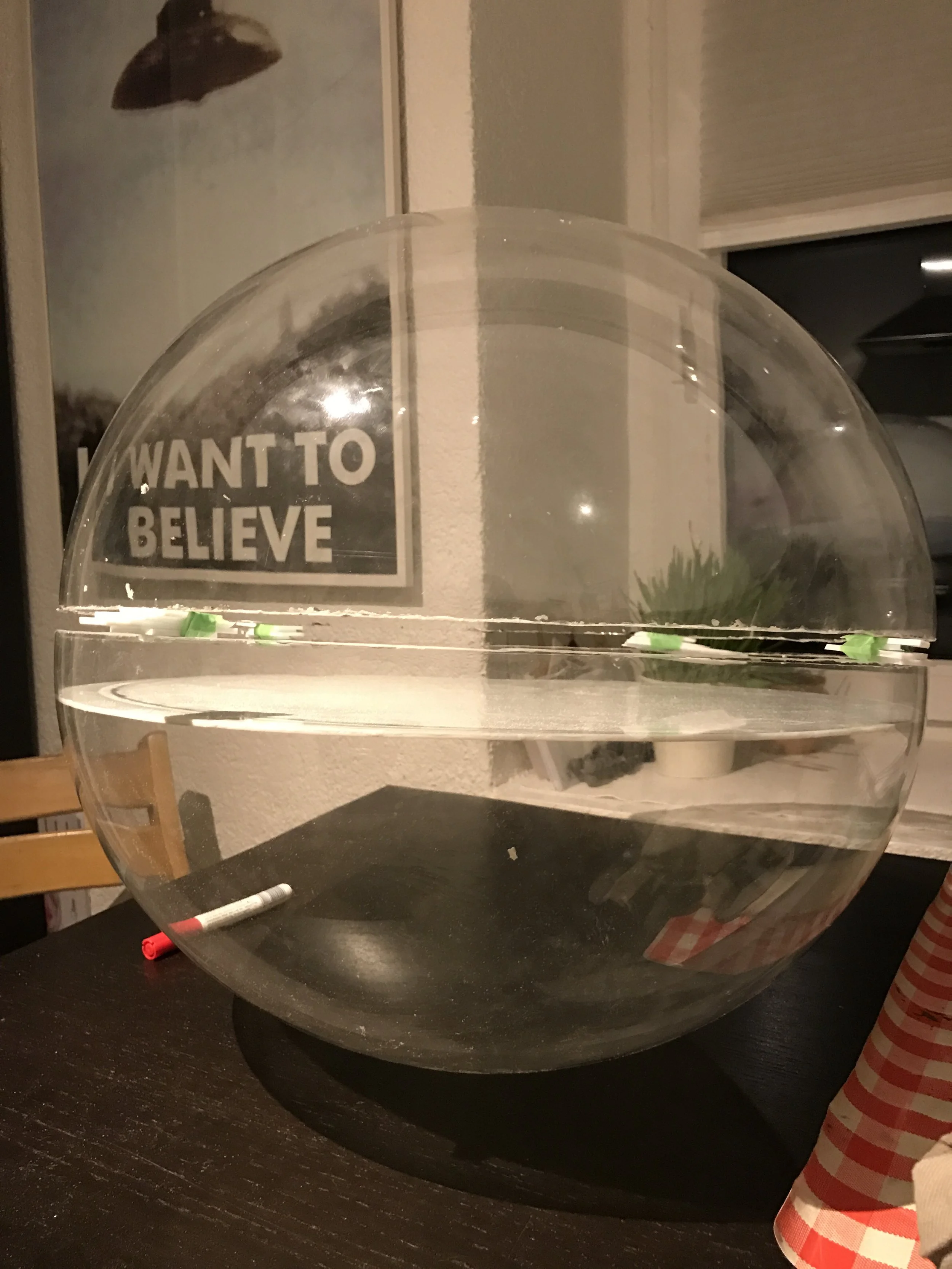
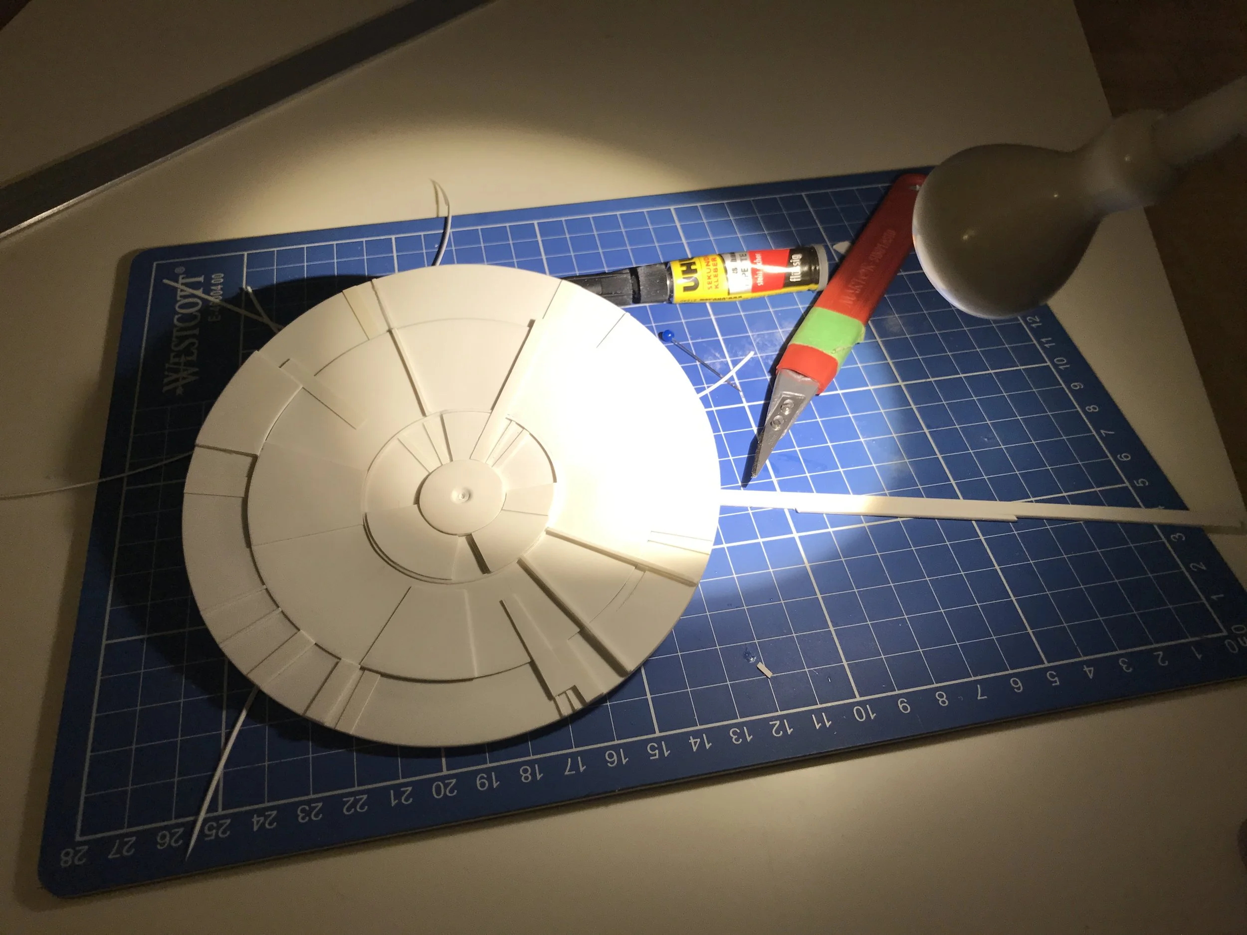
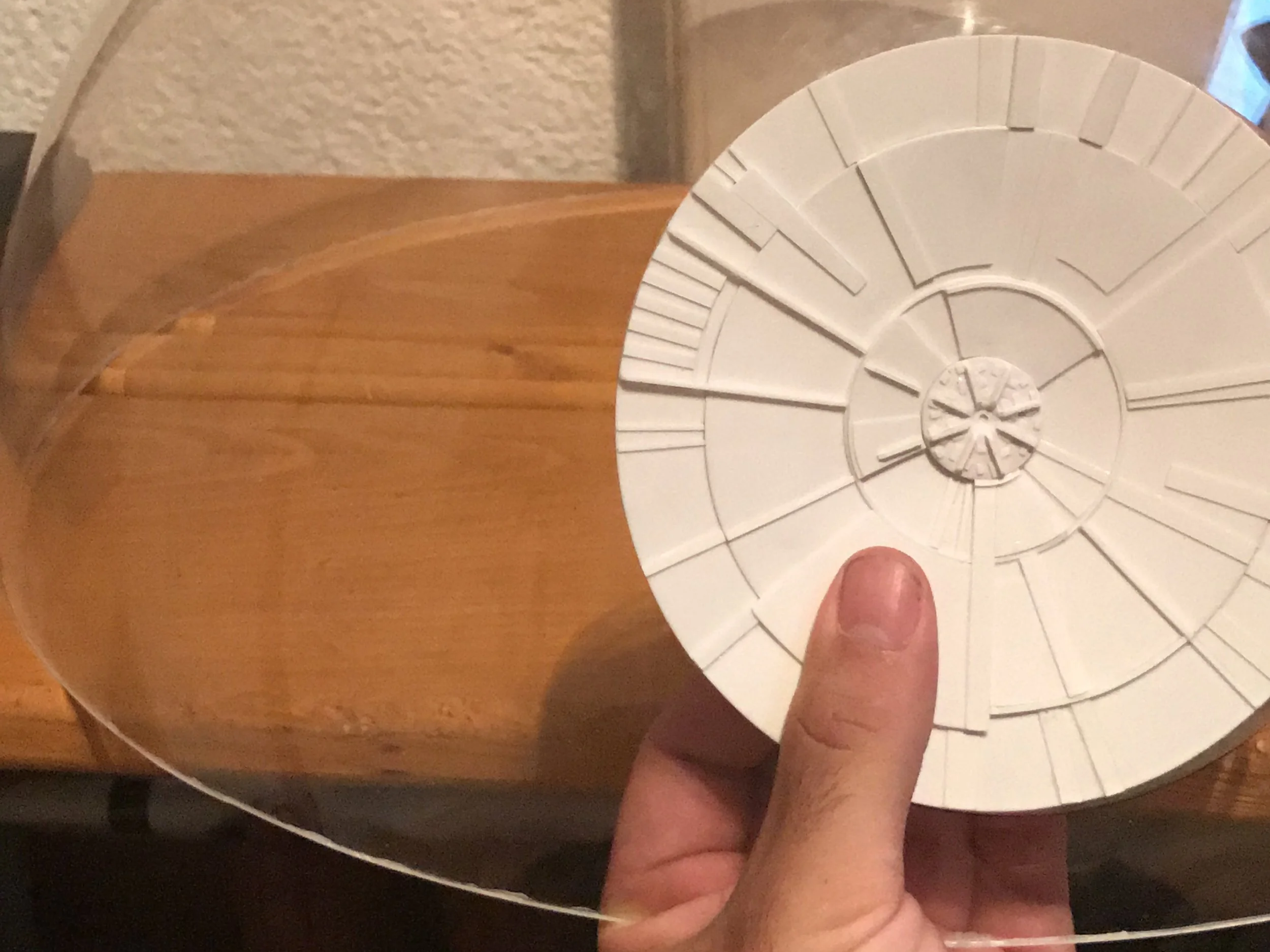
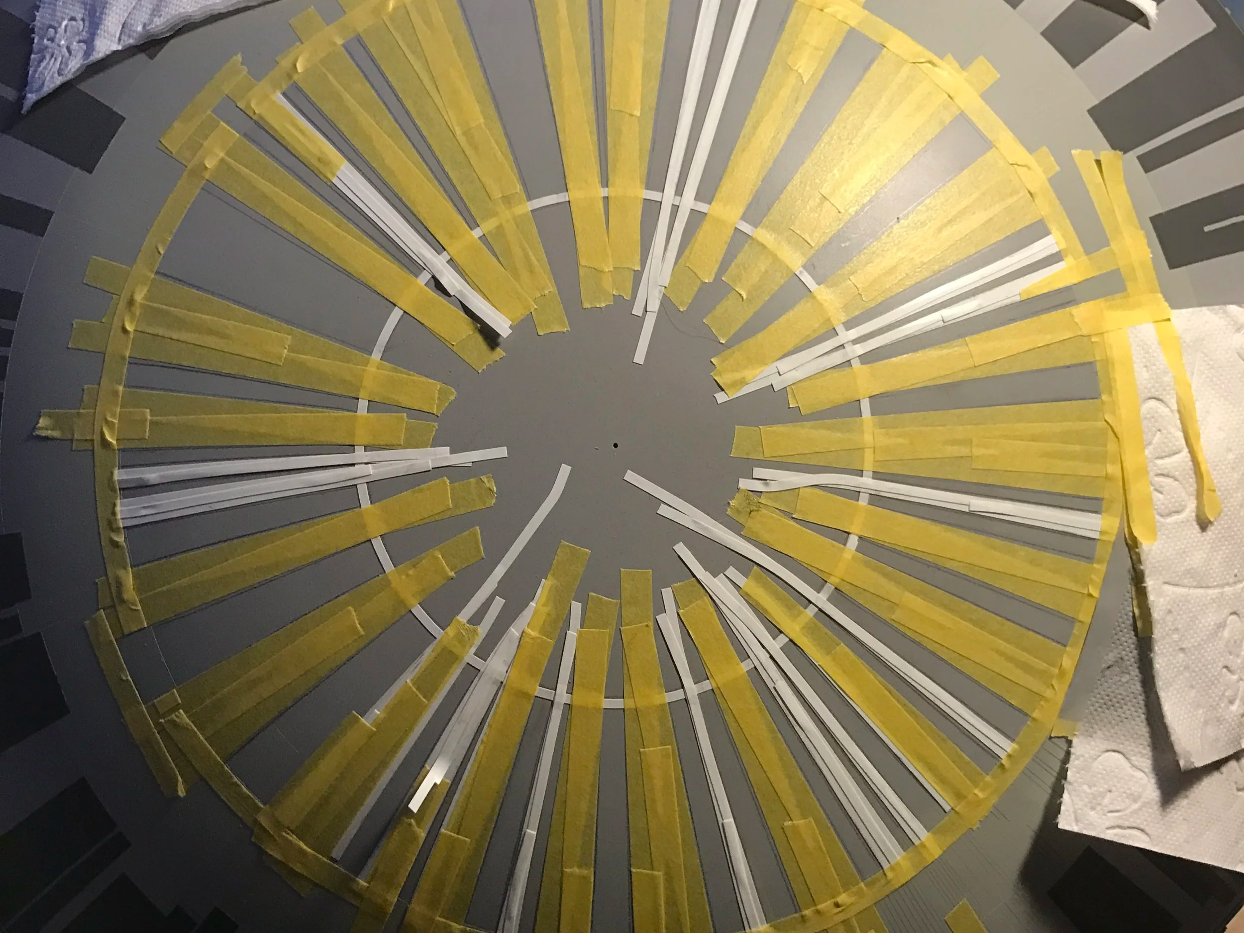
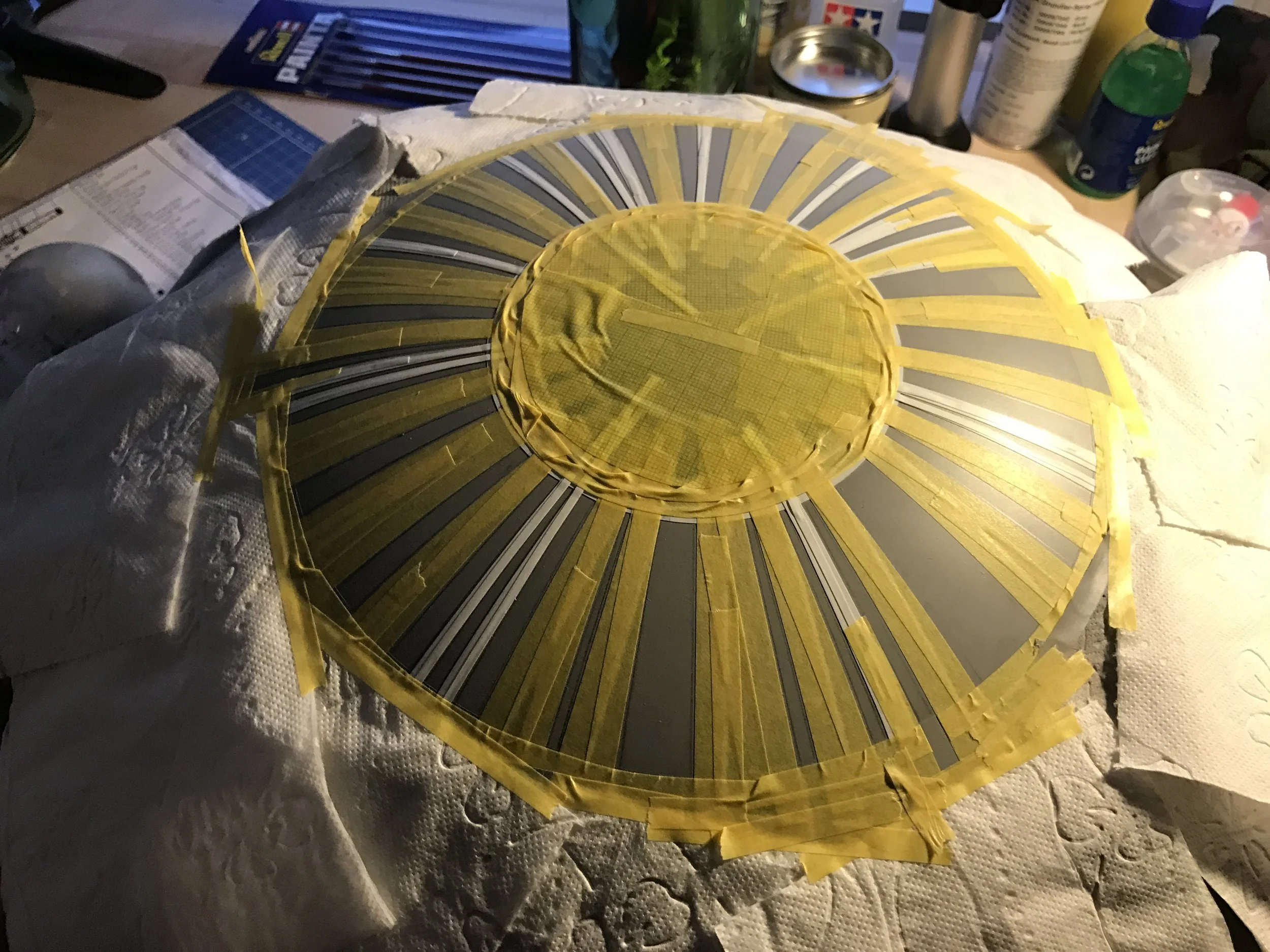
The Dish
The dish was definitely one of the most enjoyable parts of the entire project. Simply because it is the visual focal point of the Death Star.
Building the dish — and finding suitable reference images — was relatively easy. There is plenty of literature available that shows this area in reasonably high resolution.
One important detail was getting the geometry right. The dish is not concave in a curved sense. Instead, it is cylindrical and tapered inward. In other words, there is no continuous curve — just a straight, angled surface that slopes down toward the center.
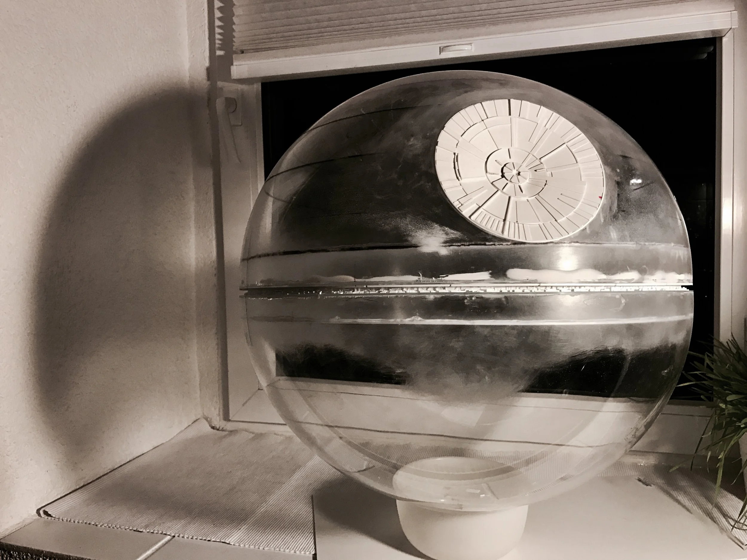
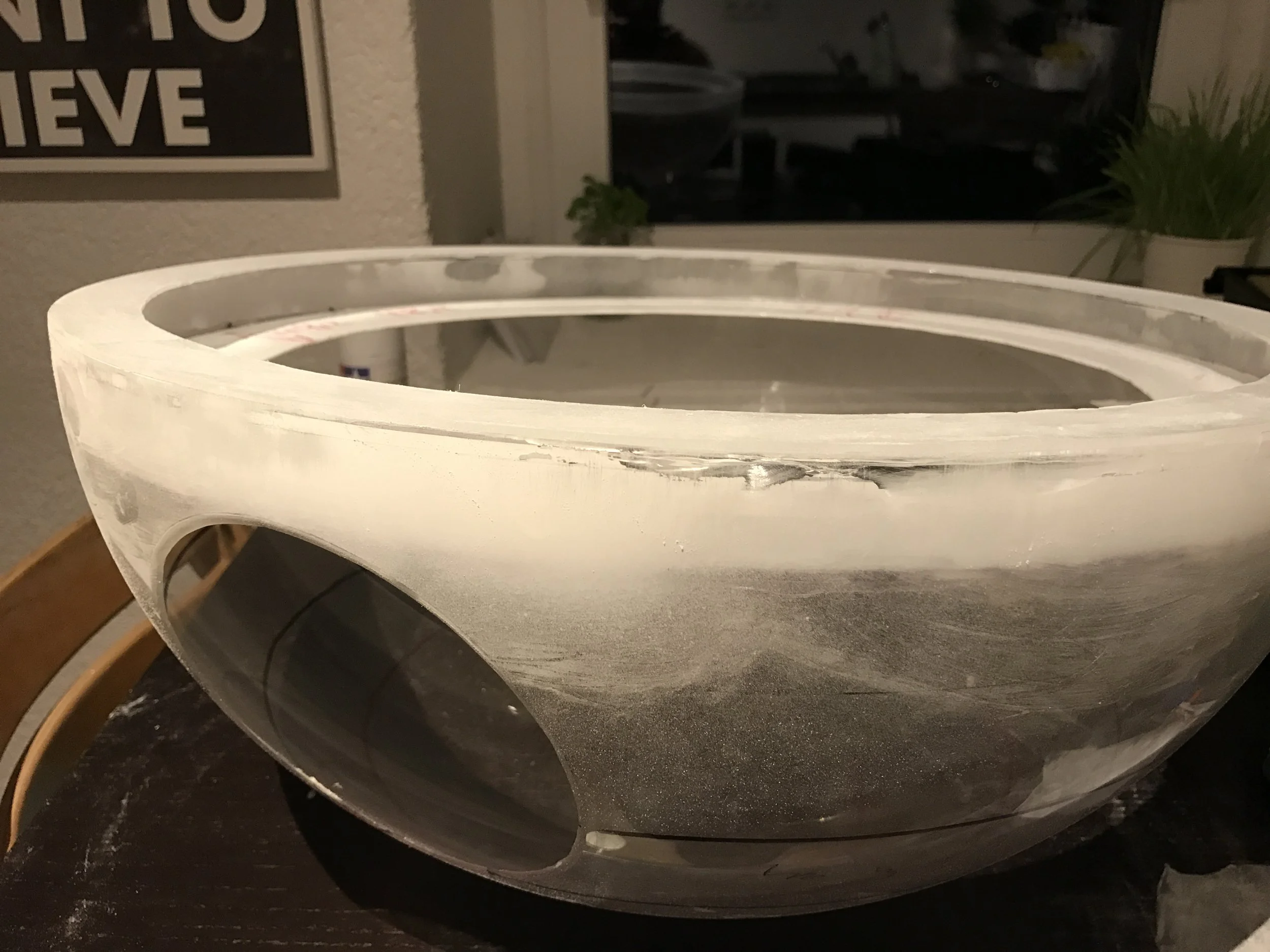
Priming the Hemispheres
Once the dish was in place, it was time to prime the two hemispheres. I was genuinely looking forward to this stage, because up to that point the surface was an awkward mix of plexiglass, filler, and sanded areas. I couldn’t wait to finally see everything unified under a single color.
The gray Tamiya primer matches the original Death Star color almost perfectly. More importantly, the primer instantly transformed the surface — suddenly the hemispheres looked like perfect, homogeneous spheres, with all materials visually blending into one.
At this stage, the two hemispheres were still not connected. That was intentional. The plan was never to permanently bond them together. Transporting and storing two separate hemispheres is far easier than handling one large, complete sphere.
It also left the door open for future ideas — for example, adding internal lighting at a later stage, possibly using a single central light source.
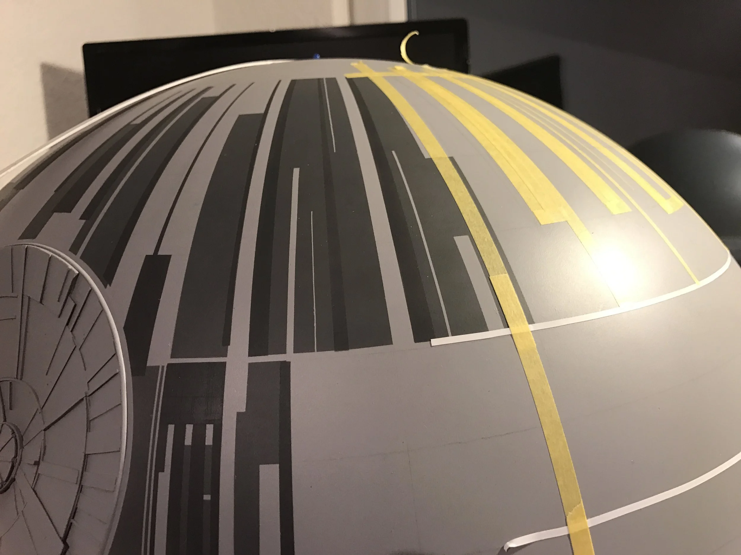
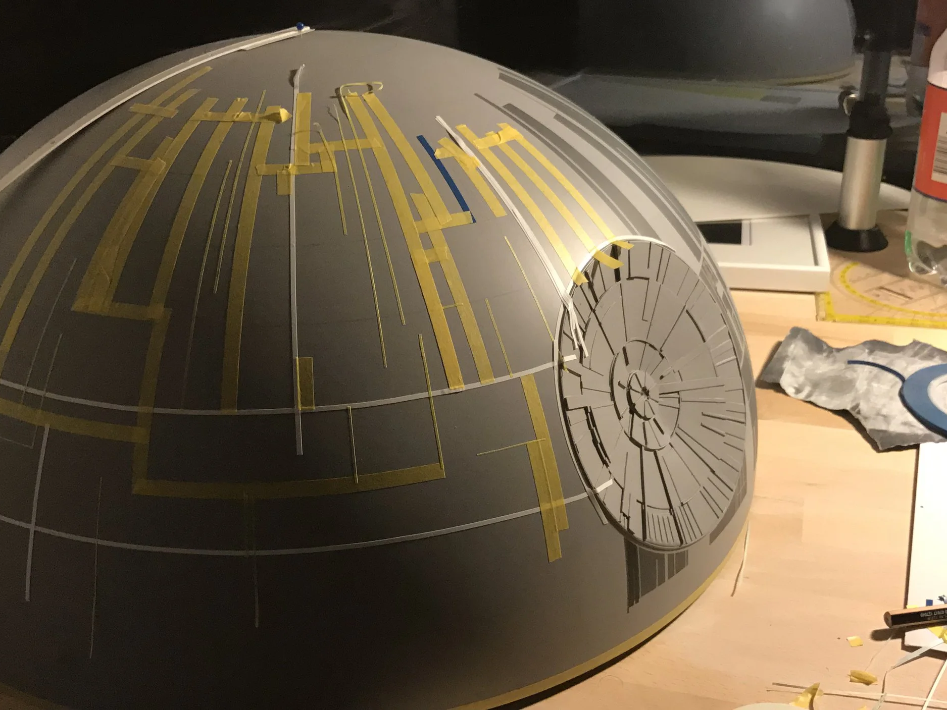
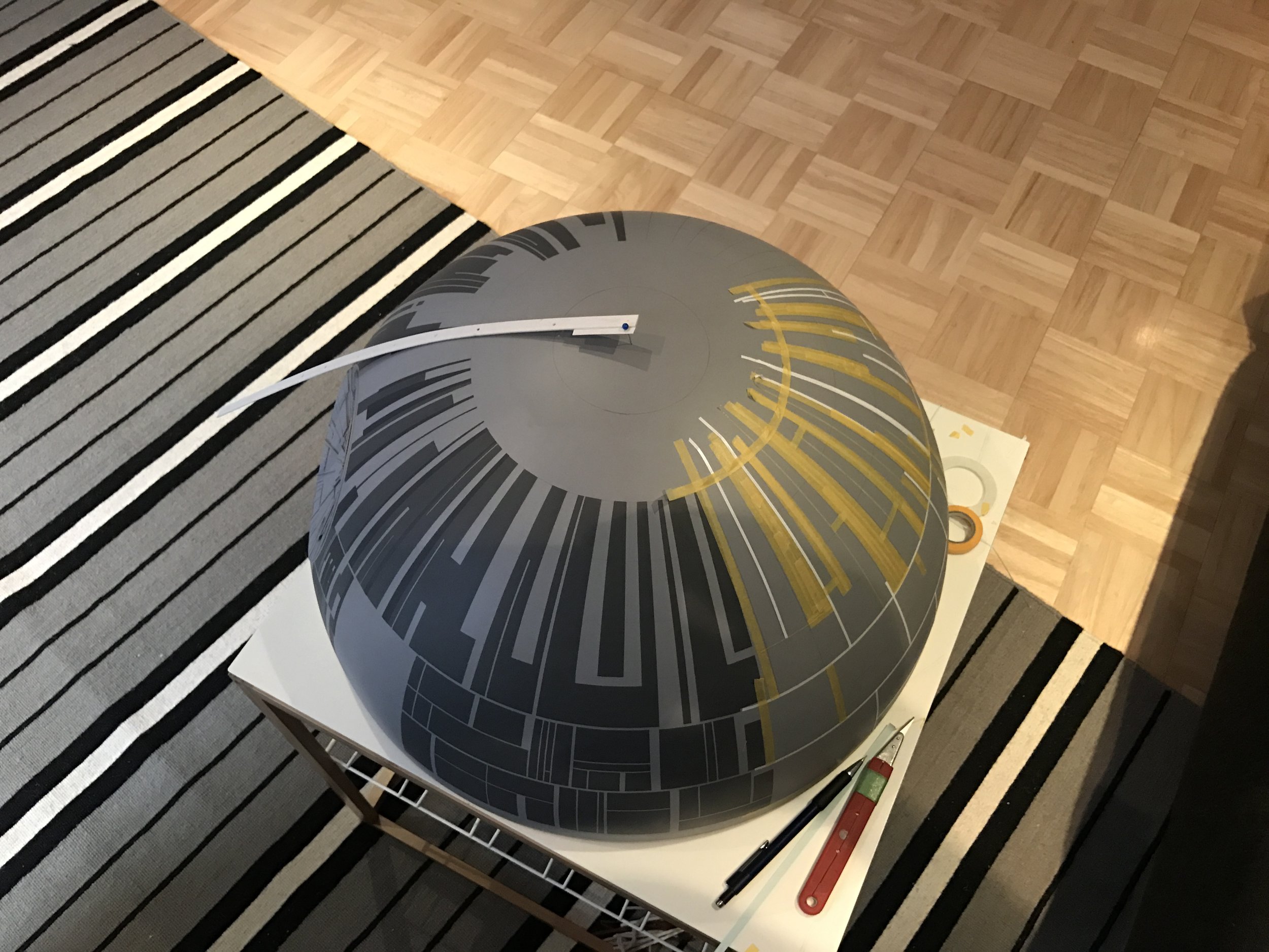
THE MAP
At this point, the basic structure of the Death Star was essentially complete. Now it was time to transfer the lines of longitude and latitude, or rather the sectors, from the 2D map onto the sphere.
What followed were hours — if not days — of masking, airbrushing, masking again, and airbrushing, all in slightly different shades of gray. At that time, I wasn’t yet very experienced with an airbrush, but this phase turned out to be an excellent learning process.
I quickly realized how incredibly precise airbrushing can be — in some cases accurate down to just a few millimeters — and all of that without getting your hands dirty. It became a key technique for achieving the layered, technical look of the Death Star’s surface.
SUMMARY
Overall, the entire project was a huge improvisation and a massive trial-and-error exercise. Considering that it was my first time tackling something like this, I’m actually quite happy with the result.
That said, if I were to ever build a second Death Star, I would do many things differently to make it even closer to the original. This would include changes to the color, the horizontal lines, and especially the equator layout — essentially reworking many of the key surface details.
Still, I like the model the way it is. It represents a specific moment in time and a steep learning curve. And who knows — maybe there will be a second one someday.
I also made a short video documenting the creation process. Enjoy watching.